Byte patient check-in flow screens

Byte: Discovery-Driven Iteration

Drove NPS from 33 to 43 through discovery-driven iteration on patient check-in flows.

Overview

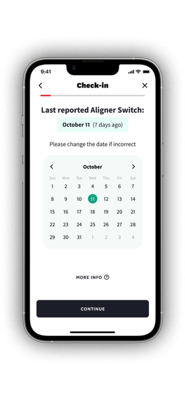
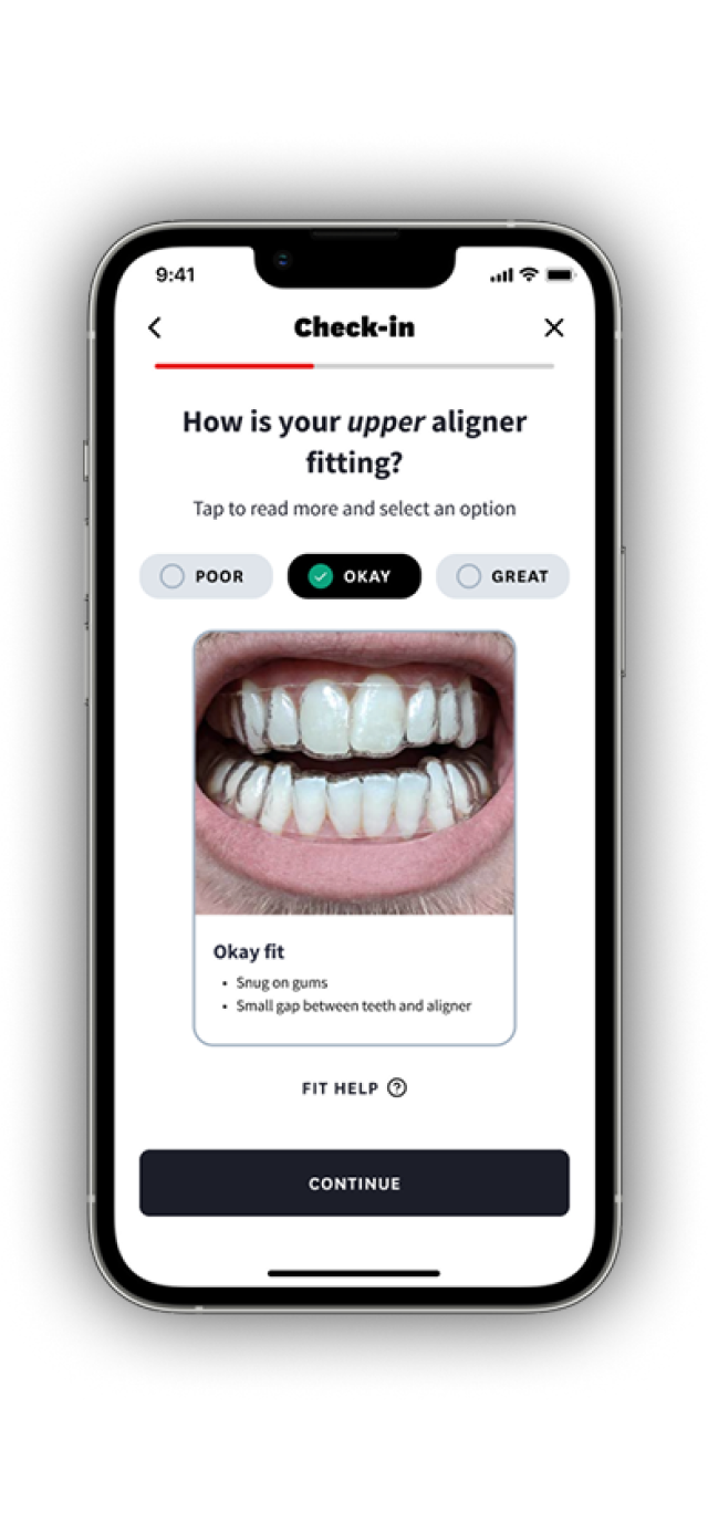
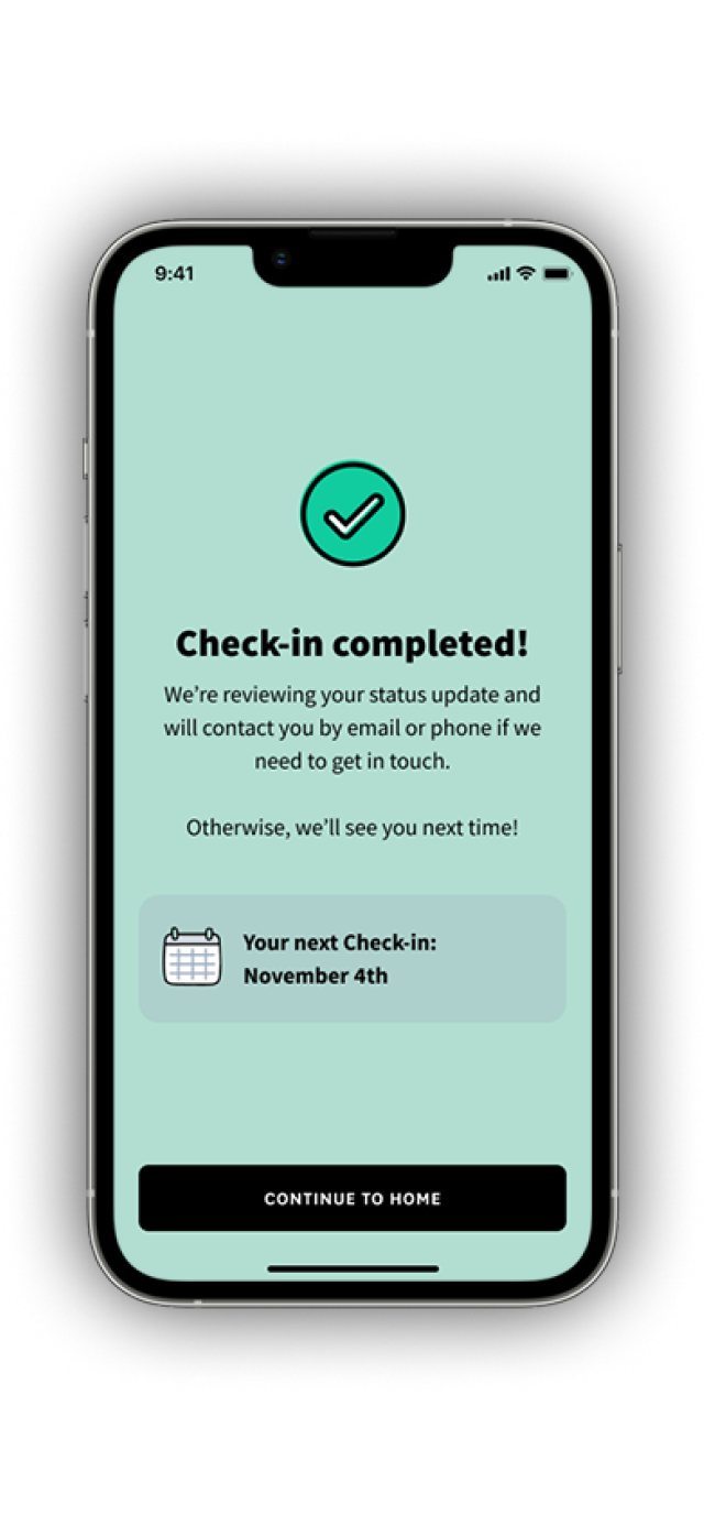
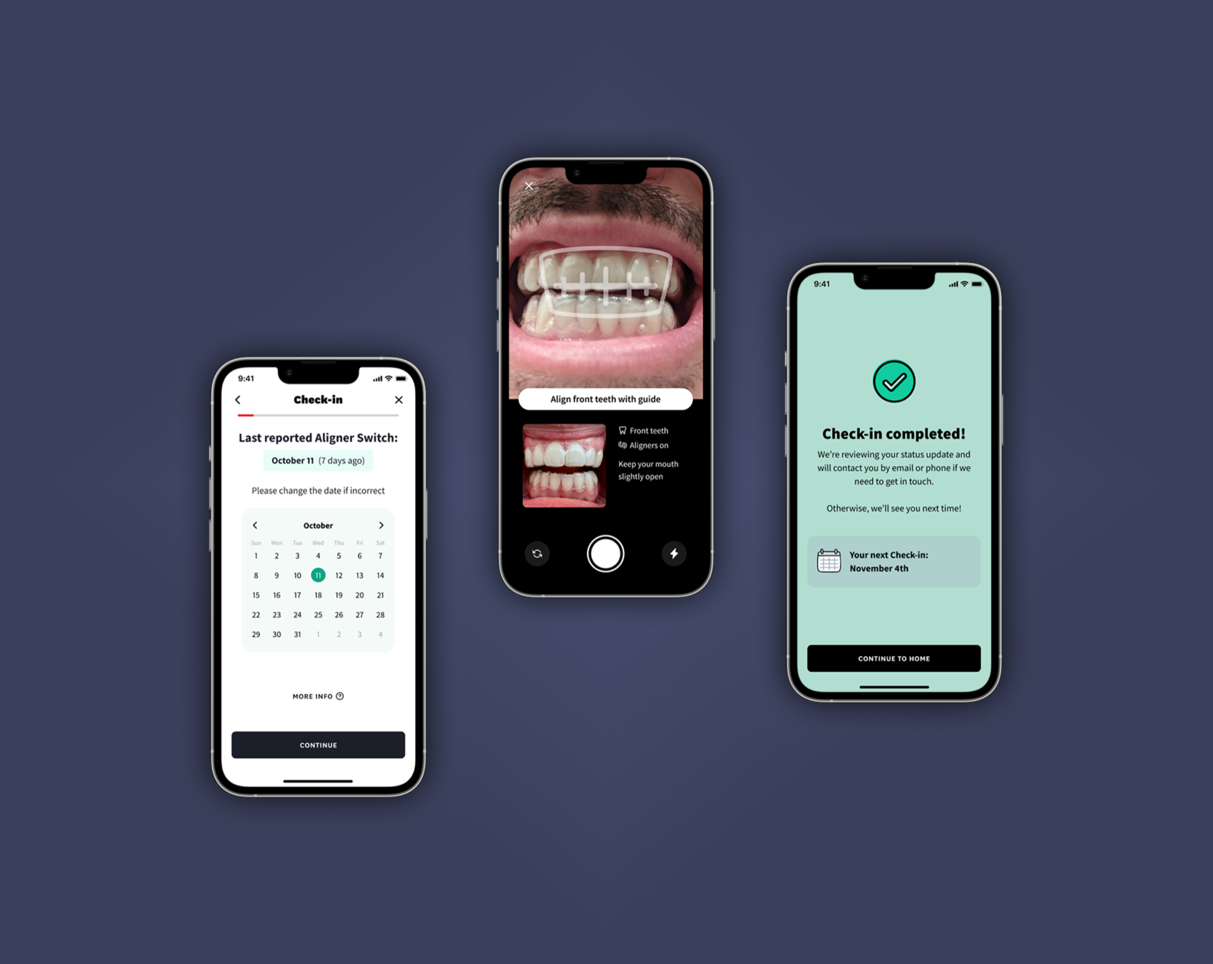
Every 25 days, Byte users were prompted to complete a Check-in: a series of questions and photos submitted through the app so our clinical team could monitor treatment progress remotely. It was our primary touchpoint for understanding how treatment was going.

And it mattered. We found that users who completed their Check-ins regularly were ~80% more likely to finish treatment on time. That correlation made Check-in one of the strongest levers we had for treatment outcomes, which directly laddered up to end-of-treatment NPS.

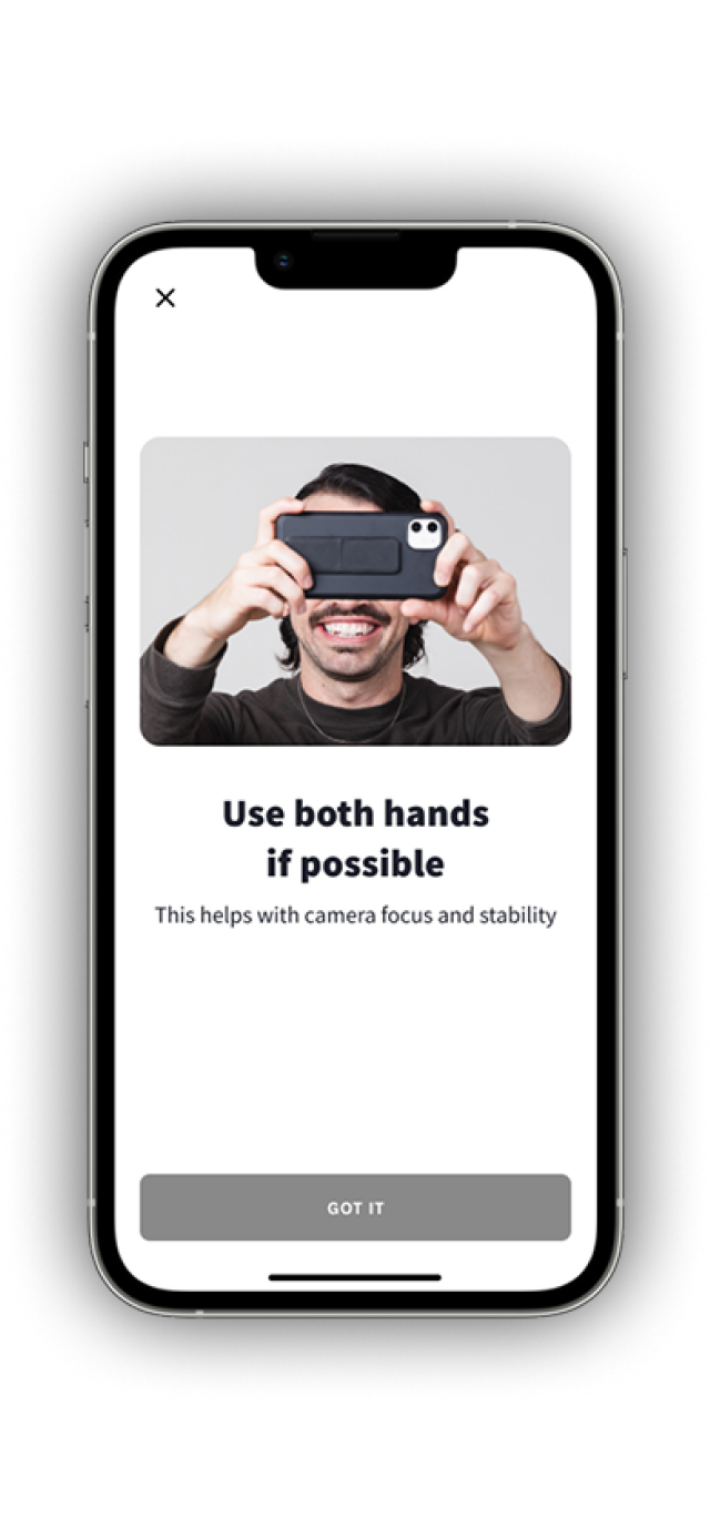
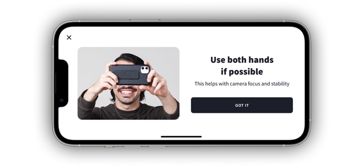
But the Check-in experience itself had friction. Users were answering questions the app already knew the answer to, struggling to describe asymmetric fit with a single dropdown, and dropping off when the camera flow asked them to photograph difficult angles. You try taking a side picture of your teeth with your phone 5 inches away! It's tough!

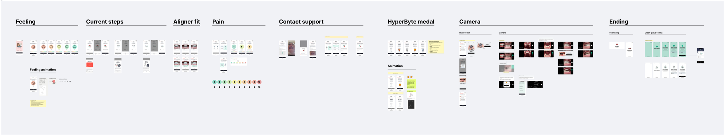
Through Continuous Discovery, we kept hearing friction points that were small individually but compounded into a frustrating experience. I led a series of iterative improvements to the Check-in, shipping changes independently as we validated them with users.

THE CHECK-IN FLOW

12 Steps, Every 25 Days

The Check-in had three phases: five treatment questions (mood, aligner step, switch date, fit, pain), five dental photo captures (front, upper, lower, left, and right occlusion), and a review screen. Twelve steps, multiple text inputs, and a camera session that required contorting your hand to photograph the inside of your own mouth. For something users did every few weeks, it was a lot.

The 12-step Check-in flow

DISCOVERY

3 Users Interviewed a Week, Every Week

Every week I recruited up to 3 users to chat with during a Thursday block and alerted everyone in a #user-research Slack channel whenever a participant arrived. Designers, engineers, stakeholders, directors/VP/C-suite were all welcome to join as an observer in Lookback. The default was an evaluative user interview to see how things were going with treatment and the app. Other times we usability tested anything we were ideating and exploring for rapid feedback.

When no one signed up or if a participant ghosted, I hosted a session replay watch party instead, inviting anyone in the #user-research channel. I wanted anyone at any level to stay close to the users we were building for. I loved it when the CTO would pop in and watch. Sometimes the CEO would message me later with feedback because he caught a replay.

The weekly discovery loop: recruit, interview or replay, share insights, prototype, usability test, ship

From this weekly Continuous Discovery practice, several Check-in friction points surfaced repeatedly:

🔁 Redundant questions

Users logged their aligner switches in the weekly Aligner Switch flow within the app. Then, during Check-in, we asked them to tell us what aligner they were on and when they last switched. The feedback was blunt:

"Why do I have to tell you when I switched if I just logged it? Shouldn't you already have that information?"

🧩 A fit question that didn't fit

The Check-in asked users to rate how their aligners fit. One question, one answer. But aligner fit isn't binary. One arch can fit perfectly while the other is hanging off your teeth. Users told us they'd split the difference and select "Okay," which didn't give the clinical team what they actually needed to better support the user.

📷 The camera wall

Taking photos of your teeth with your phone 5 inches from your face is tricky. The front view is manageable. But upper arch, lower arch, side occlusion with one hand pulling your mouth open and the other holding your phone out of your peripheral vision? Nearly impossible. Many users said it was like shooting from the hip. On top of that, the completion funnel confirmed it: the camera flow is where users really dropped off.

🪨 Dead weight

We also discovered that the "How are you feeling?" question at the top of the Check-in was completely unused. Neither clinical nor support teams acted on that data. It was just another tap standing between users and done.

ITERATIVE IMPROVEMENTS

Small Wins, Shipped Independently

From discovery, we mapped the opportunity space. The outcome we were driving toward was treatment completion, and Check-in completion was the lever. The friction points we'd surfaced branched into two paths: a longer-term bet — the AI Aligner Fit ScanSee how we built an ML-powered fit assessment feature →, which would eventually replace parts of the Check-in but was months away from FDA clearance — and a set of quick wins we could ship now.

Opportunity tree mapping Check-in friction points to treatment outcomes

With the exception of the new camera experience, the quick wins didn't require heavy engineering lifts. They were the kind of work that could be slipped in between larger projects or picked up when an engineer was waiting for a bigger PR to get approved. That was the point: small, uncoupled changes we could ship independently without blocking anything else.

We didn't have LaunchDarkly set up for formal A/B testing yet. Instead, we followed a tight loop: identify an opportunity through discovery, design a quick solution, and usability test it the following week to confirm direction. For every change, I coordinated with Clinical, Support, and our Salesforce PM to make sure nothing broke downstream since the Check-in fed directly into Salesforce case data.

🔄 Pre-filled what we already knew

We pulled the aligner step and last switch date from the existing aligner switch flow, so users didn't have to re-enter information the app already had, just confirm and continue.

↕️ Split fit into upper and lower

Instead of one fit question, we broke it into two. Now users could report that their upper arch fit great but their lower arch wasn't. The clinical team got the specificity they needed to act and ensure users would be able to complete treatment on time.

📷 Redesigned the camera experience

This was the biggest chunk of work. My Product Designer studied competitors and experimented hands-on with the phone, landing on a rotation prompt that guided users depending on the angle. Watching users go through our prototype was especially insightful — we could actually see where and when they struggled.

✂️ Removed the dead weight

"How are you feeling?" was cut, making Check-in a bit easier and breezier to complete.

Check-in with pre-filled aligner data Check-in with separate upper and lower fit ratings Redesigned camera experience — vertical prompt Redesigned camera experience — rotated landscape view Check-in completed screen

RESULTS

Contributing to the Bigger Picture

End-of-treatment NPS rose from 33 to 43. Check-in improvements were one contributing factor alongside treatment satisfaction, case resolution speed, and refinement timelines. We validated each change through usability testing before shipping and monitored the Check-in funnel after each release. Without A/B testing infrastructure, we couldn't isolate the exact contribution of each change — but the cumulative direction was clear, and the process we built to continuously discover and ship became a model the team carried forward.

REFLECTION

What I Learned

What I learned: Not every improvement needs a big launch. The Check-in changes were small, individually unremarkable, and none of them required a PRD. But stacking iterative wins from Continuous Discovery added up. Users noticed. What I'm most proud of isn't any single change we shipped — it's that I built a discovery process where everyone from engineers to the CEO stayed close to our users, and that process surfaced the right problems to solve.

What I'd do differently: Push harder for experimentation infrastructure earlier. We were confident in our direction from usability testing, but having A/B testing would have let us measure impact with more precision and build a stronger case for continued investment.

Other projects