Byte in-app support status cards

Case Study

Byte In-App Support Case Status

Uncovered through continuous discovery, this end-to-end project improves customer experience and operational efficiency.

Overview

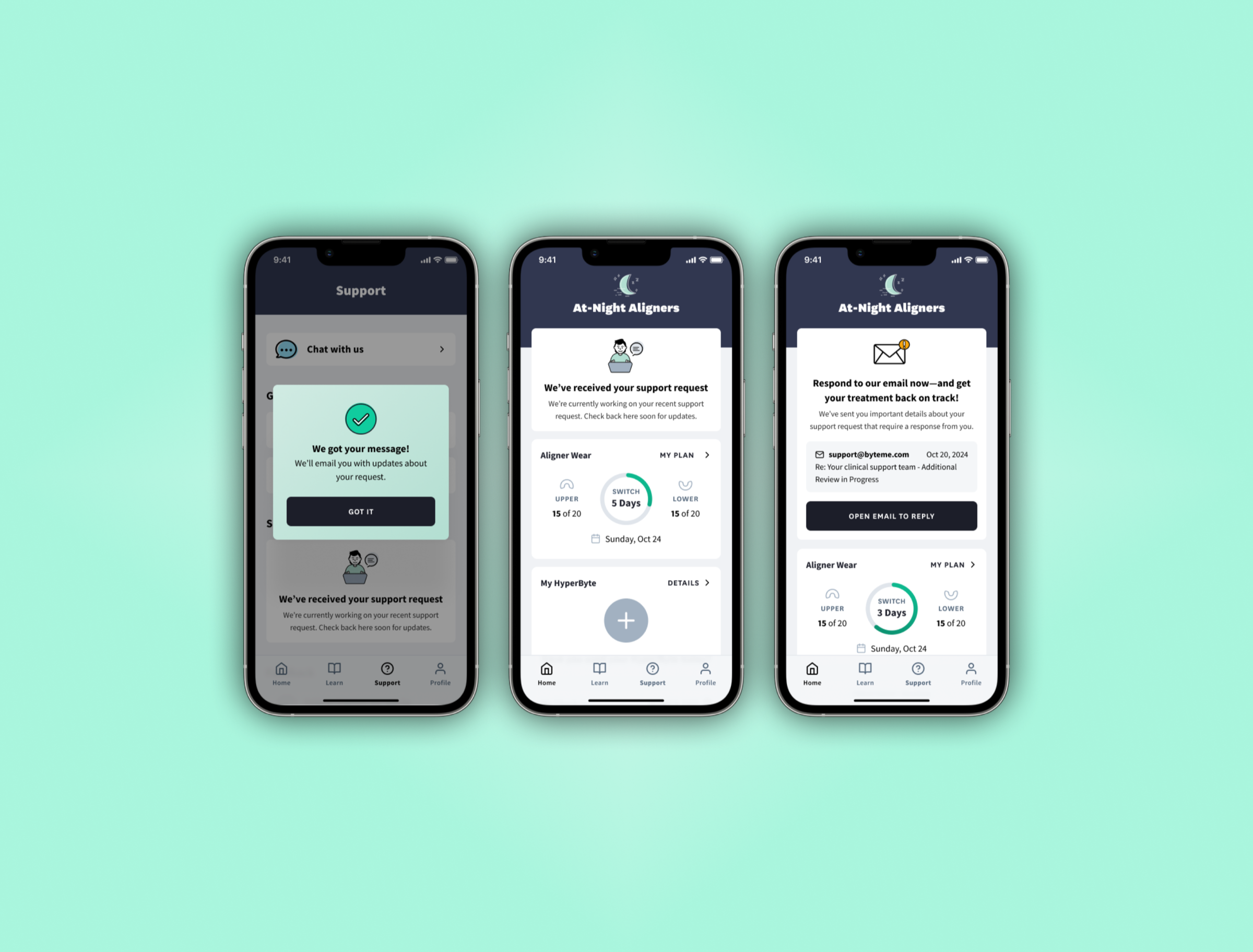
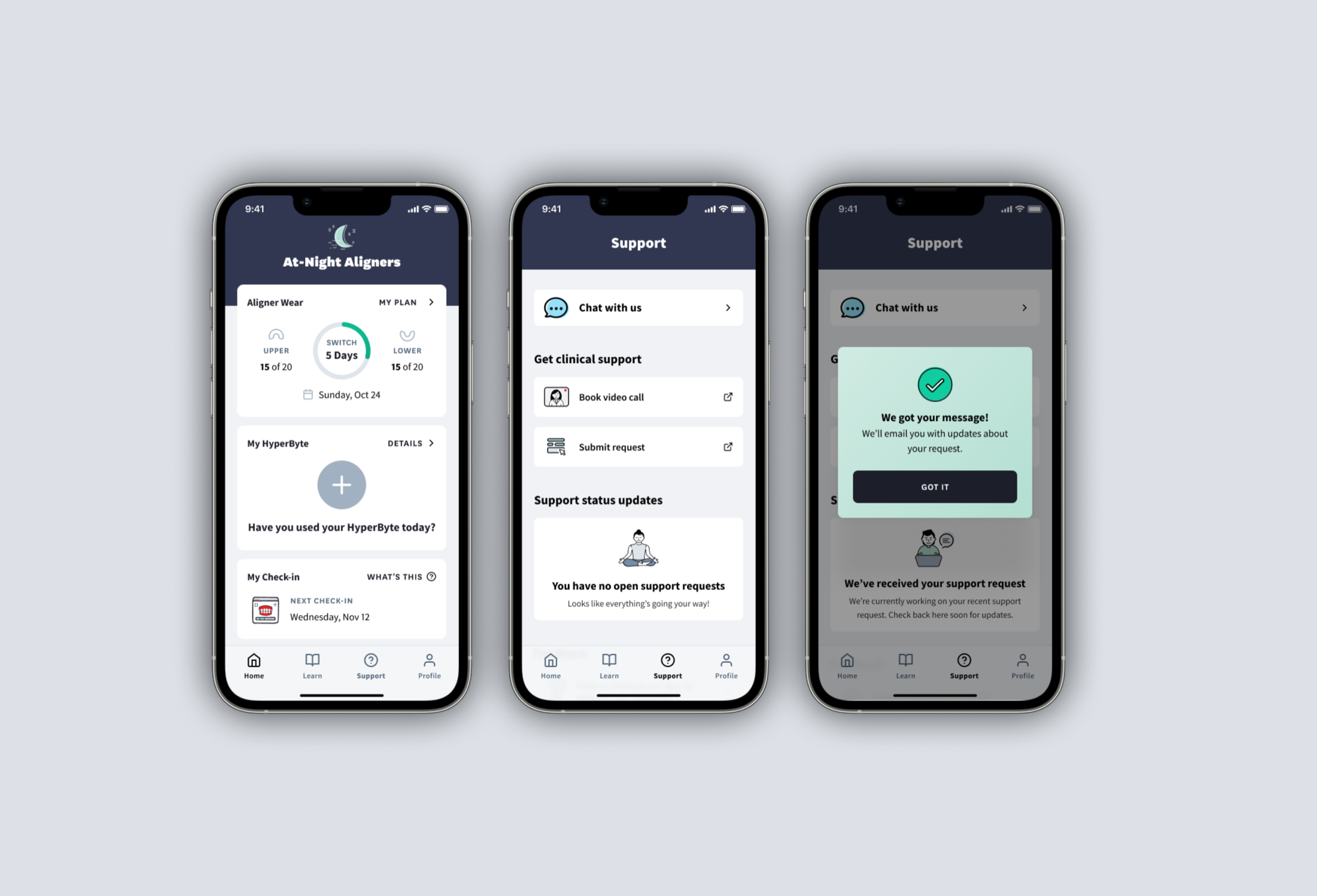
Byte's DTC (direct-to-consumer) clear aligner treatment averages a few months, and during that time, users don't have to see a dentist. Naturally, that means the My Byte app is their lifeline: it tracks treatment progress and lets them submit support requests when something feels off.

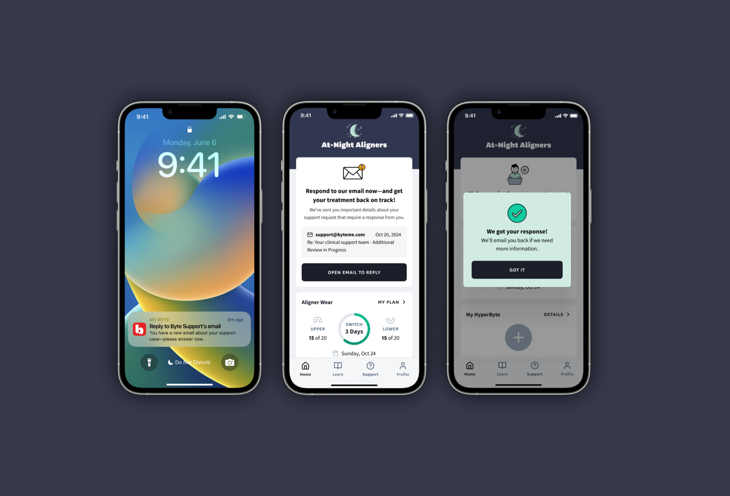
However, after submitting a request, users were left in the dark. Within the app, no confirmation, no status update, no sense of whether anyone was even looking at their case. Worse, our responses went out via email, which sometimes landed in spam. If too much time passed without a reply, the tele-dentistry case became clinically invalid and users had to start over with a new submission.

The result: frustrated users resubmitted duplicate cases, adding to the overall support burden.

I led the initiative to close that gap by bringing support case visibility into the app.

DISCOVERY

How we found the problem

I established Byte's Continuous Discovery practice: a lightweight system for recruiting, interviewing, and sharing user insights across teams. Through our weekly interviews, my Product Designer and I kept hearing the same story from users who'd gone off the happy path in their quest for support.

🤷 No confirmation

Users weren't sure we received their request, so they'd submit another one.

📨 Lost in spam

Our email responses sometimes never reached users at all.

⏳ 21% stuck

Cases were sitting in a "waiting on user response" state, usually for clinical inquiries that required follow-up.

Users weren't ignoring us. They just never saw our reply.

The opportunity

With 85% of users on the MyByte app and on average 50,000 DAU, it made sense to explore leveraging the app to bridge the gap between users and support.

SOLUTION

Why not in-app messaging?

The long-term vision was full in-app messaging between users and the support team. But HIPAA compliance made that a significant lift. We needed a way to close the feedback gap immediately and a compliant chat system would take much longer.

The solution: display real-time support case status cards directly in the app. The cards showed case status plus a preview of the support team's email response (date, subject line, and message preview) so users could locate it in their inbox.

🔍 Scoping what to show

The source of truth was Salesforce case objects, but we didn't want to surface everything. Sales cases, insurance cases, and other teams' workflows didn't belong in a user-facing status card.

I worked with operations and support to build a filtered list of case types that made sense: regular support and clinical support only. Then I socialized the list across teams to make sure nothing was missed or misrepresented.

Legal's top concern was simple: don't display any patient information. The email preview threaded that needle: enough context to act on without exposing patient information.

🔄 Change management

Surfacing case status to users also meant internal teams had to be more disciplined. If a support rep left a case open after resolution, the user would see it as still in progress. We had to make sure teams weren't leaving cases open, because the status card would expose it. Partnering with the Salesforce PM ensured that cases closed automatically after 2 weeks when photos became clinically invalid.

📣 Extending the feedback loop

With an 85% app adoption rate, the in-app card covered most users. But we went further with lifecycle marketing, extending the feedback loop to push notifications, email, and SMS so users got updates regardless of how they engaged with the product.

For cases needing a user response, we included an actionable CTA that opened their device's default mail app. This was the critical path for the 21% of cases stuck in "waiting on user."

Final support case status card designs showing three states: request received confirmation, case in progress, and response needed with email CTA

LAUNCH

Status Cards in the Wild

The status card displays on the app's Home screen and Support screen when a user has at least one in-progress or response-needed case. When there are no open cases, the Support screen lets them know all is well.

67%

Engagement with the response-needed CTA

7%

Increase in response-needed case resolution within the first week

Home screen showing support status card with case in progress, support screen menu, and request confirmation modal
When the user doesn't have an open support request, they'll see the default home screen and a 'no open request' screen in the Support tab.
Support screen states: no open requests, case received confirmation, and in-progress status card
After a support request has been received, we'll notify the user of any updates inside and outside of the app.

REFLECTION

What I learned

Support status cards were never on a roadmap. They came out of weekly user interviews that I'd set up as part of Byte's Continuous Discovery practice. Investing in discovery infrastructure pays off: talk to users regularly, and the right problems surface on their own.

Other projects